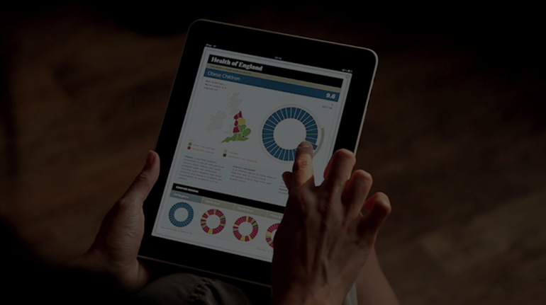
The Times Infographics
Read the case studyWhen News International launched the iPad edition of the Times in 2010, they were eager to take advantage of the interactive, touch screen format to offer readers new ways to consume the news and better understand the stories. They approached Applied works who, over the course of 2010 and 2011, delivered several interactive projects that ran alongside key news items such as the World Cup, the Royal Wedding and the anniversary of the Battle of Britain.
The first of these projects, The Health of England, is an intensely data rich news story that illustrates the radical differences between the North and South of England in terms of health and health care. Taking full advantage of iOS's WebKit framework, I helped Applied Works create an innovative touch based interface using advanced HTML5 & CSS3 features that were not widely available at the time in desktop browsers.
The iPad had not been launched in the UK at this point, and the only available test units were chained to a desk deep inside News Internationals head office. Ensuring that the iPad could handle the data and interface, alongside the actual iPad app it was running in, required some careful planning and design to keep memory and processing to an absolute minimum.
All the info graphics are self contained HTML5/CSS3 & Javascript displayed inside the Times app via a UIWebView. On one hand this provided us with access a lot of new and exciting features that weren't available in a desktop web environment, but each project also brought with it a unique set of technical challenges that had to be addressed. For example, the Times App itself used a lot of the devices built in memory; when we tested the Battle of Britain project on the device and inside the App, we found it kept crashing due to memory shortages. Javascript does not provide a way to monitor memory usage, and bugs in iOS's Javascript Engine meant we had to be creative with the way we loaded and unloaded images.
Web Fonts were critical to ensuring The Times branding was communicated in a way that wasn't possible on desktops at the time. We worked very closely with the App development team to stay on top of changes to the App and to iOS that directly affected how UIWebViews access and display Web Fonts. Due to the way the App was built, we did not have access to events such as orientation changes and so we created our own implementation using CSS media queries.
Our work with The Times went on to win awards from Design Week and a European Design Award for digital information design. The work was later ported to the web to provide additional content for readers behind the pay wall. Since the projects all made heavy use of advanced HTML5, CSS3 and Javascript features not widely available on the desktop, a whole new set of technical challenges had to be solved.
The Times work is not easily available to view online, but you can find out more about this project on the Applied Works website.
-
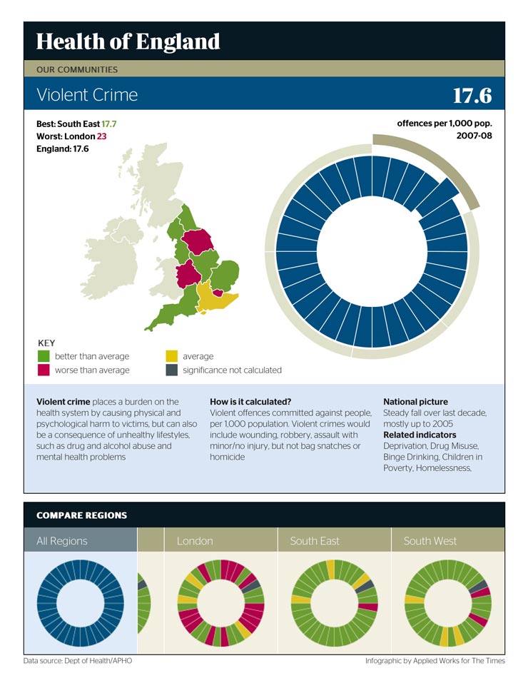
I used SVG and Javascript to implement a circular navigation suited to touch screen interfaces. Users can also click on the map to drill down to a specific region.
-
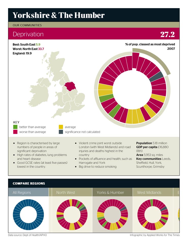
The 'wheel' (or 'cheeseboard' as I call it) also served to provide an 'at a glance' over view of a regions performance by colour coding the individual wedges.
-
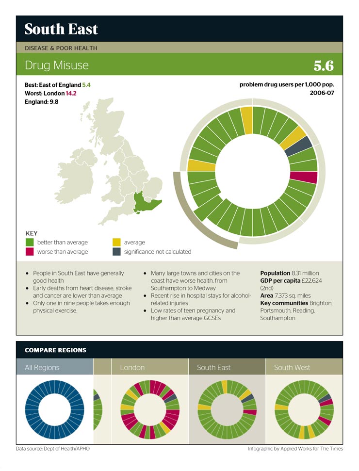
The infographic was extremely successful at illustrating the differences between each region, but more specifically the differences between the north and south.
-
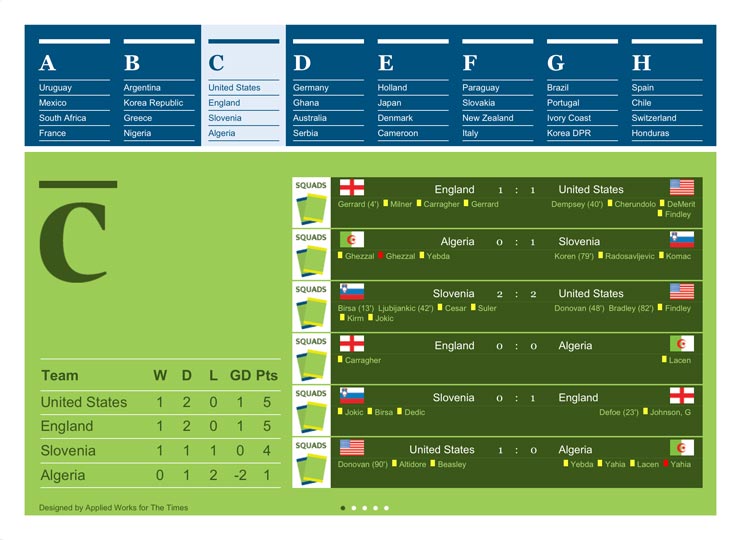
For the World Cup, we created an interactive wall chart. A digital version of the wall charts commonly featured in newspapers during a major footballing event.
-
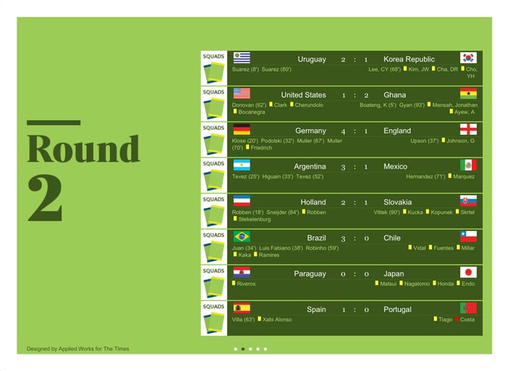
The wall chart was updated in real time with data from stats.com, so you could enjoy England's 4:1 defeat at the hands of Germany without a radio or television.
-
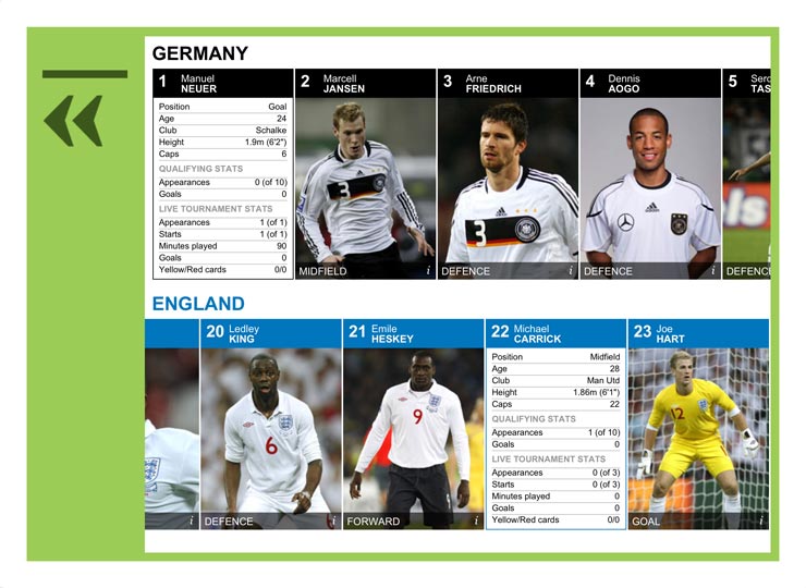
Users could compare teams and 'flip' player cards to compare the stats for individual players. As with scores, player stats were updated in realtime.
-
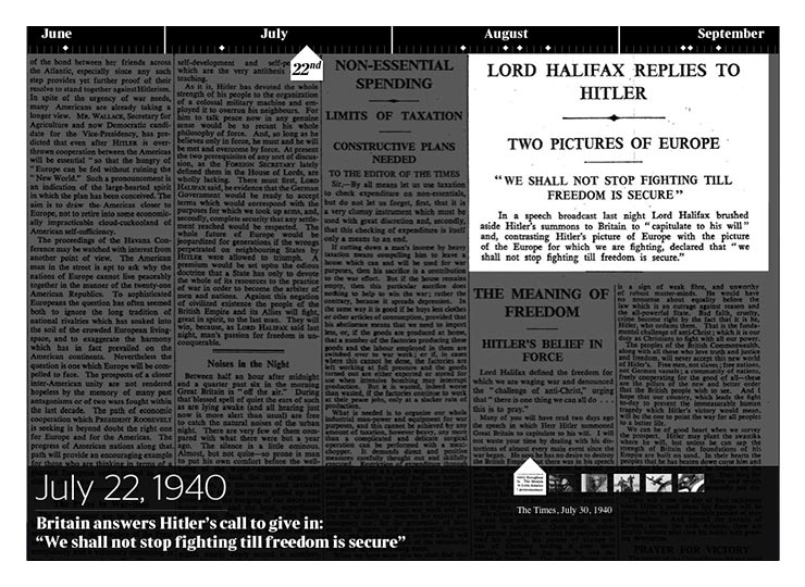
The Times drew on their huge archive to create an interactive timeline of images and audio commemorating the anniversary of the Battle of Britain.
-

To celebrate the end of George W. Bush's second and final term in office, The Times published another interactive timeline documenting his controversial tenure as President.
-
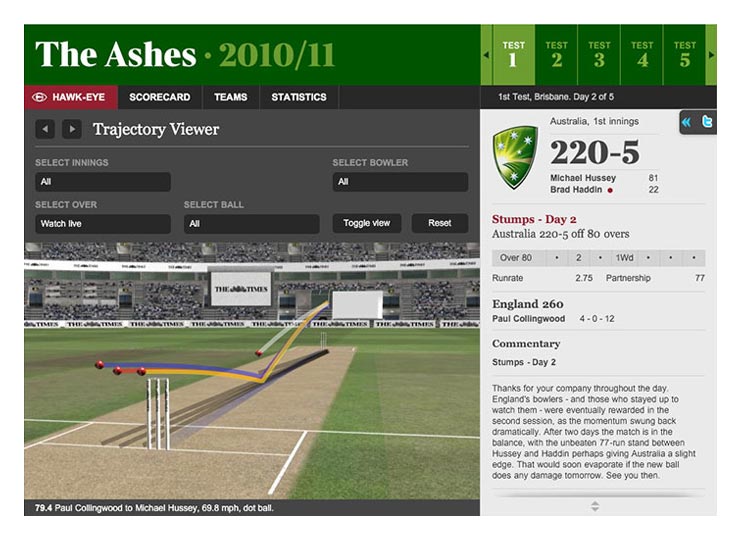
I worked closely with the people behind Hake-Eye to help solve critical performance issues when porting their trajectory viewer from Flash to HTML5.
